Our newest fully vaccinated, social-distanced healthy version of iPlanner is now fully opened up and accepting users, so that’s the one you’re now safely using. Congratulations!
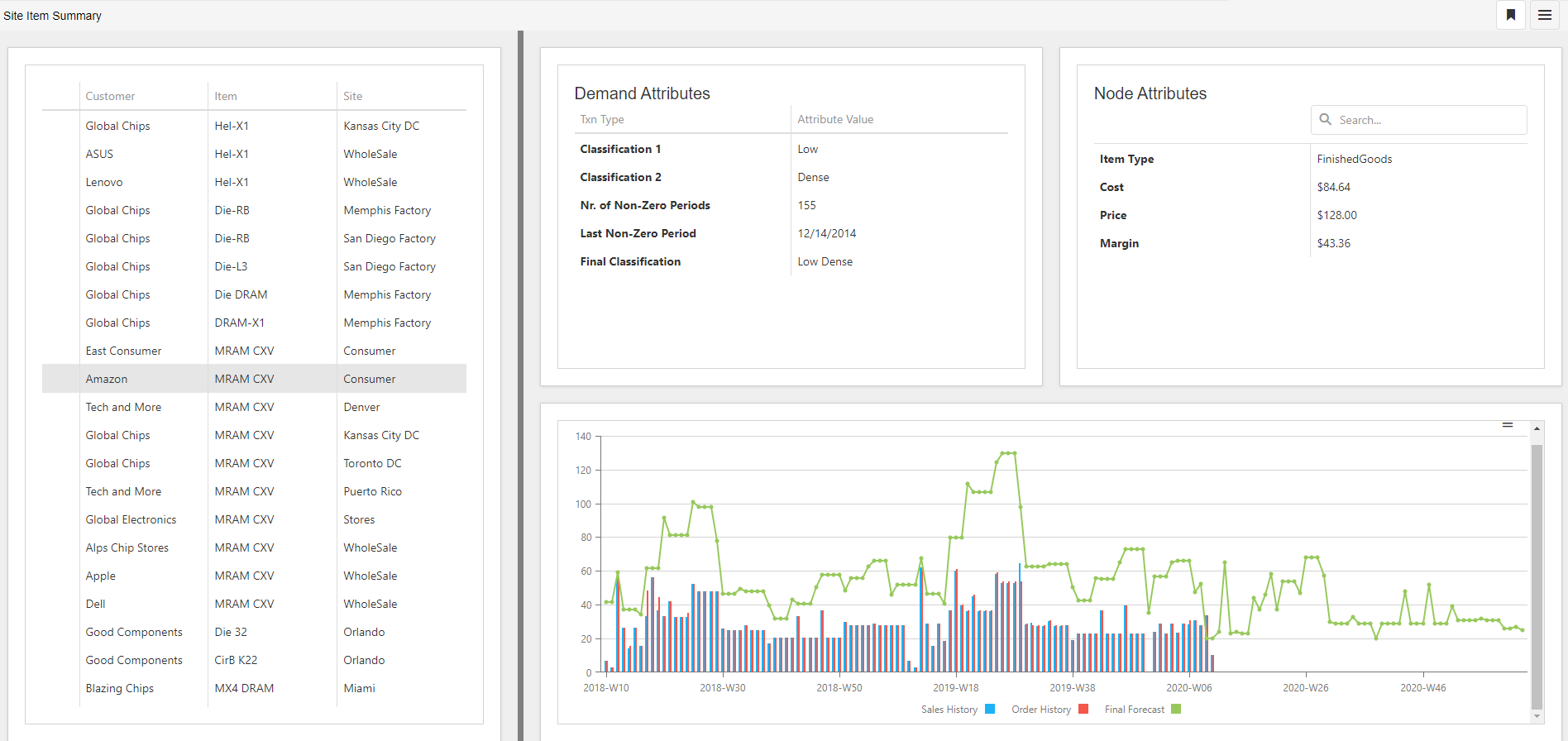
Site Item Summary
Sometimes we have all the parts, but we just need to step back, rearrange, and give them a new life. Site Item Summary is a user favorite, but the team challenged themselves to make it even better.
Now you can decide for yourselves what information is most relevant to you and have that being your view. As you select nodes in the navigator the contextual information is displayed in the other views, allowing you to analyze and manage more effectively.
We are pleased with the results and hope it makes your day!
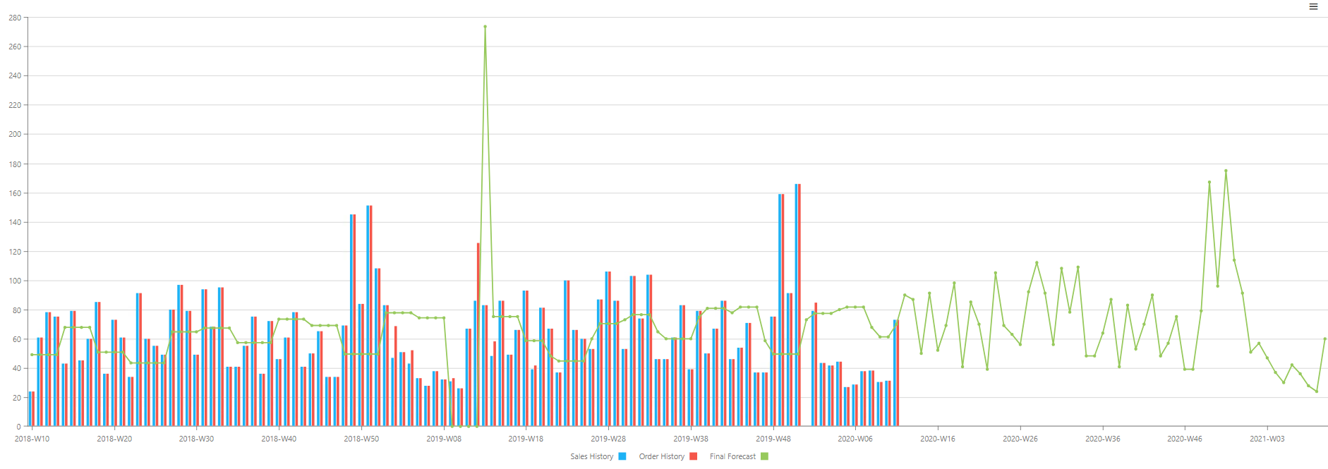
Run & Analyze Forecasts in UI
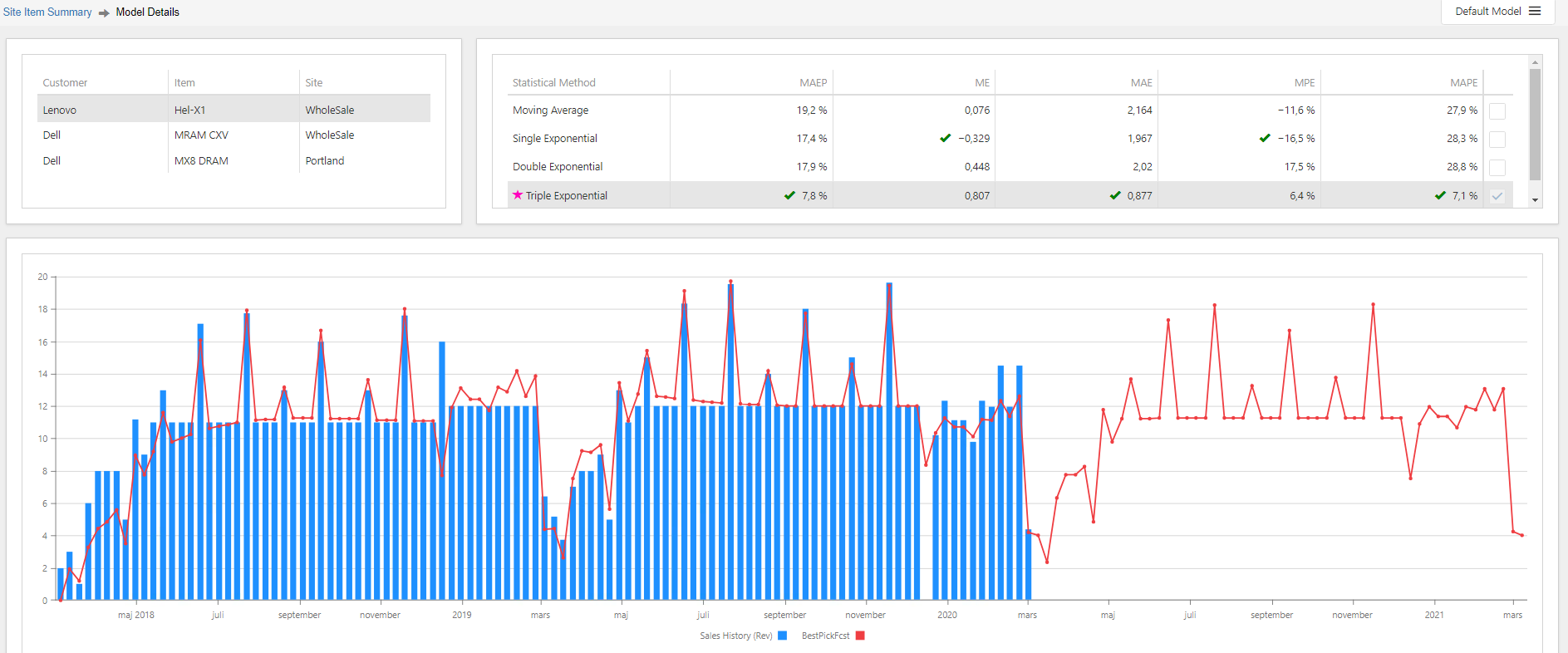
When you are looking into a forecasting outlier, wouldn’t it be great if you could further analyze it and address it right away?
We spent a lot of time evaluating and forecasting health care data as well as vaccination data during the covid pandemic and realized that would be awesome. Hence, now you can run & analyze forecasts from UI outliers and then evaluate the results on the fly.
We know, sometimes you must experience the problem yourself before that identifying an improvement opportunity exist. Thanks for your patience.
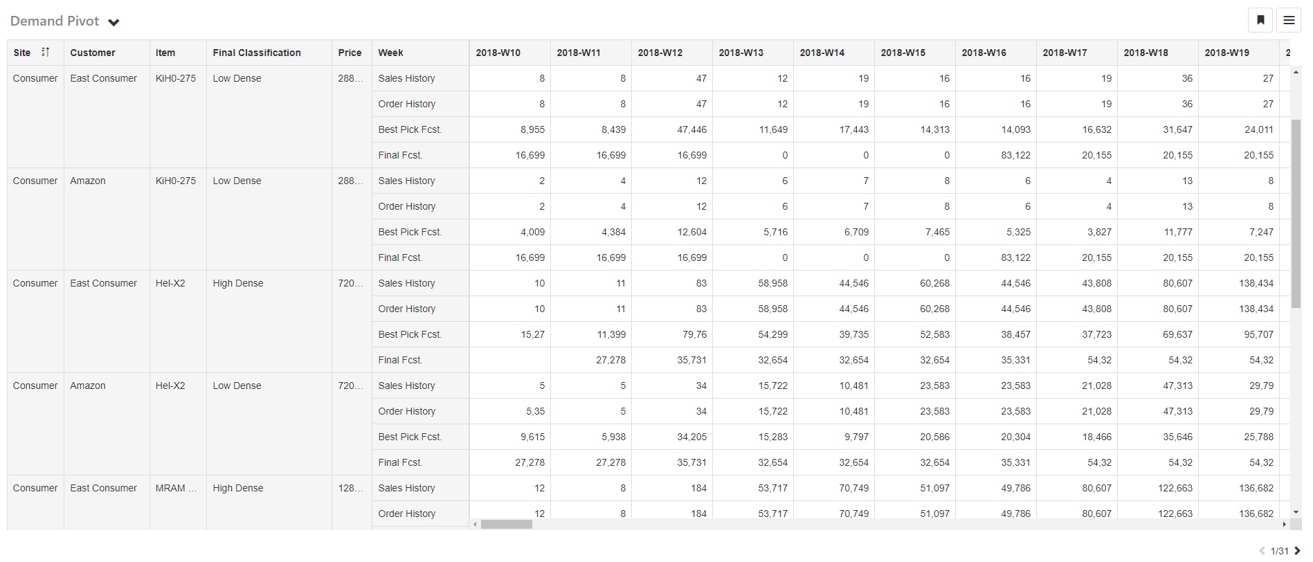
New and Improved Demand Pivot
With the continuous increase of data, we want to leverage more to give us better results and faster. Our team specializes in identifying and addressing bottlenecks before they become a problem, so they decided to give us a data superhighway.
This has enabled the new and improved demand solution. As with most infrastructure projects, the magic happens behind the scenes.
The result is that data is moving much faster, and we are set for the next data growth path.